Friday, December 10, 2010

End of the 2010 Semester


My last post on Images and Ideas was back in October. I had gotten to a place where I felt like I was blogging to myself - or is that flogging? In any case, it would have been good to have had on-going dialogue, discussion, interaction, debate...hello, is there anyone there?

I thought that I'd finish this semester with a few drawing highlights from the final portfolios. Maybe even throw in some commentary to see if I get any bites. Here goes:


David Jones has a passion for basketball, and he extended that passion into his series of drawings. Various athletic poses n the way to the basket.


Daniel Marshall's passion is music. Here is one of the drawings he created that was inspired by his musical instruments and equipment.


Alex Stotts did a series of drawn hands depicting the drawing of hands, cut from their context and placed into shadow boxes. Two are represented above.


This is a digital image of a digital image, so I apologize for the reflections. This was Sam Chumley's series project, creating a 'graffiti'-esque image on the basement wall of a friend's home. It was documented via photos and video. The video, some fifty hours worth, went through a collaborative editing and refining process between Sam and Chris Little. The result was a little more than two minutes of fast-forwarding of the process from beginning to end. Maybe Sam will get this posted on Youtube.


Daniel Frank is a skater, and this drawing was one of six he created this semester that explored the dynamic poses of skaters without their boards. He had explored some the Robert Longo images of Men in the Cities.


Wende Cudmore has been experimenting and exploring the production of vegetable papyrus. She's not only creating hand-made papers from the pulps of the vegetables, but she's also pressing the vegetables into thin sheets. In the bottom piece above, the center panel is actually parsnip cut and pressed into a thin, almost transparent sheet, stitched and mounted between plexiglass.


Shane Doebler created a fifteen foot tableaux of psychological narrative that hinted at so many possibilities that it was a little frightening. The image above was conceptually part of that bigger image, but it was on a single panel.


Patrick Berry created a series of images exploring the effects of a mirror in landscapes. In some the reflected image was part of the environment, and in others the reflection pulled information that was out beyond the subjects of his drawings.


Marie Tingle's series was about a pair of dragons. She explored them through four drawings that eventually focused on the textures and colorations. That focus was, in part, inspired by a shift in her medium, from soft pastels to pastel pencils.


Louise Clausen started her series as she left off this summer (check back there to see those images), with figures in water. Only this time an intense experience she had moved her priority and process into a new direction, where gravity and expression took over the representation.


Lori Ritchie did a series of flowers, mostly focusing on the blossoms, except in this one where she got more involved with the space as much as the flowers.


Kristin Thompson created four large-scaled (30" x 40") drawings of a brick in different settings with oil pastels. The surfaces are energetic and the lights and darks very compelling. The scale of each also adds a great deal to the images. Kristin's process is very aggressive, so she needed that much space to be able to move around with her response.


Kim Salaices also created four large scaled images that were more psychologically charged, based on porno addictions. She chose to represent this idea by creating images of bound women with accompanying text, some of which is legible, and other parts not.


Jessica Elam responded to the ephemeral and hypnotic qualities of smoke. She started using pastels and eventually switched to bleach on black Arches that allowed the illusory layering transparencies of smoke to move across the surface.


Fran Dietl's series allowed her to continue investigating fantasy via computer illustration. Although the image above does not do justice to this particular piece, it is clearly an other worldly character that she made hints of in a series she created last summer.


Danny Palafox found some inspiration in some Jim Dine tool images. Here is an example of the three drawings of 'still-life' nuts and bolts, created with pastels and prisma color pencils.


Alex Kennedy's appropriated Madonna and Child images, this one with gold leafing, are intriguing responses to religious representation in the history of art and his own Catholic upbringing.

Saturday, October 9, 2010

TUESDAY'S CRITIQUE/DISCUSSION


On Tuesday, October 11, we will have a mid-semester critique over the series in-progress. A group critique for the series will be different than ones for other kinds of projects, because of the individual work on unique ideas and that each person will be presenting his or her work to the rest of the group. It's a good idea to be prepared to talk about your ideas, how the series has progressed or changed, and what you think the next step might be. The following are some things to think about in preparation for discussion of your work.

  • Are enough time and commitment being put into the work?
Remember, at least six hours per week should be devoted to this.
  • Is a clear direction emerging, or do you sense several different possible directions?
If several, what are they? Which one makes the most sense to you and why?
  • Does the size of the work and the media being used seem to be working with the ideas?
The scale of the works should speak volumes about your idea.
  • Are there signs of a breakthrough or are surprising new directions emerging?
Are these good surprises (possible potential for development) or bad surprises (unforeseen problems or contradictions)?
  • Is the work invigorating, that is, dos it excite you?
Do you feel fully engaged with it? Would you rather be working on your series than just about anything else? Does the work interest other people (your audience)?

Tuesday, September 21, 2010

State of the Series

Last week we had a long discussion about the many ideas that were being considered for the semester-long series project. The ideas were, for the most part, the result of thinking, "What am I going to draw for my series?" Perhaps a better approach would be to start drawing, anything, from anywhere...from observation, from imagination, from experimentation. Also beneficial would be defining the problem in your own vernacular, "What is a series?" Perhaps a collection of related images created in succession. Maybe they relate conceptually, maybe by process, maybe by subject. Look at the examples that were distributed at the beginning of the semester, look at the examples from our blog, research artists who work in series (that's probably going to be almost all of the ones you find).

The summer classes that responded to the same project, albeit compressed, generally had 3-6 drawings by the end of the summer session. Six weeks as opposed to sixteen weeks. Makes me curious to see what a ten week difference makes to the evolution of such an ambitious project.

As each series begins to develop, there will likely be changes made, media explored, ideas adjusted. You may end up with ten drawings, with four of them constituting a resolved series. Be open to that possibility. In the end, it will be far better to show and discuss the four that are related in succession, than the ten that jump from one idea to another, or one media to another. Not that the entire exploration of ten drawings couldn't be included in final portfolios, but for the presentation of the final series, the four may be the cream of the crop and worthy of saying "this is the culmination of my creative investigations."

Sunday, September 12, 2010

New Drawings

Again, one of benefits of having a dedicated studio for drawing students is being able to work on still-life arrangements for longer than just a few hours during one session. The following drawings were the result, for the most part, of two sessions, although a couple were finished in one. The still-life was composed of several unifying white geometric forms, illuminated with colored lights, and the contrasted with a black chord woven through the forms.


Shane's response focused in tightly on the forms and he improvised on the wire to create what almost appears to be tomb stones and ivy.


Patrick's approach was a tighter and more carefully blended range of values and colors with a stronger sense of external rather than internal light.


Marie's handling of the pastels feels very painterly and adds another unifying element to the image.


Kristin's process demonstrates a lot of spontaneity, giving the white plaster forms a strong sense of energy.


AlexS barely opens the composition which gives the space a very compact feel. His use of pastels and layering of color also creates a very painterly surface.


AlexK captured a strong sense of space through the dramatic use of light and dark. He also has a spontaneous approach to his work that imbues the image with a lot of energy.

Thursday, September 2, 2010

Where we are....

Having the drawing studio designated for the S200, S301, S401, and S405 classes is proving to be very positive change for that part of the program for students in those upper level classes. Today we were able to look at all the work that each person created so far this semester, all hung on the walls at the same time. And although we are still relatively early in the semester, seeing three in-class images from each one in the class was enlightening, and inspiring. It allowed us all to see with a better perspective the approaches to balancing process, media, and idea. It allowed us to see how ideas are formed and how ideas come from the drawing process.

This was one of Shane Doebler's drawings that was created during an off-campus visit to the Falls of the Ohio State Park. He took advantage of the rock formations and the spatial distancing, one of the beautiful qualities of the Falls, to push his process from soft and atmospheric, almost abstract, to distinct and informed. (Click on any of the images to see a larger version)


Sam Chumley's response to the project, "create a drawing based on the element of wind", utilized a heavy rag paper and fine tipped markers to suggest the energy of wind on the landscape. The combination of the marker-marks and the paper texture resulted in a line quality that in some places lacked visibility, but in concept felt windy.


Louise Clausen found a great tree to draw, a mighty Sycamore sensuously rooted into the rocks at its feet. The patches of white under the shedding bark almost appeared fleshy, and Louise capitalized on that characteristic.


Kristin Thompson has an aggressive mark-making approach to her work that is clearly identifiable in any subject she approaches. In this response to "wind", the butterflies almost appear animated by the balance between her subject and her process.


Jessica Elam sat on the edge of a rock slab at the Falls of the Ohio and took in an expanse of the environment, pushing color into color and value into value, until she found this response to that situation. The pastels were initially aggressive, but eventually found a quietness to the execution.

I found Alex Stotts sitting in a valley of rocks looking out toward the river, his hand moving as fast as he was looking, as sensitively as he was seeing. He layered colors and values and was very open to incorporating additional approaches. I can feel that space.


Alex Kennedy's response to wind takes the character, tension, and gesture of line and creates wind. When I asked the class if there was a drawing that truely expressed the element of wind, one person immediately responded to this drawing. I felt that everyone had a similar response.


Saturday, August 28, 2010

Tuesday at the Falls of the Ohio

Here are a few shots from a previous trip to the Falls of the Ohio. The locks at that time were open, and now they're closed. The expanse of water in this image is now an expanse of fossil beds and rock formations. (See weather information below)


This is just below the railroad bridge on the dam. You can see lots of driftwood around the park along the river. In fact, if you have some time tomorrow (Sunday) to go down there to explore, you might find the very spot you'd like to draw on Tuesday.


This is one of the more jungle-like areas with sandy paths that run along the river just before you get to the rocks and fossil beds.


This was a group from that drawing session about to wrap things up. Again, you can see how high the water was. Now you can roam around out in that area without fearing that you'll be swept away.


Directions from IUS:

Grant Line Road to 265E heading toward 65 S, exit onto 65 south, take exit 0 just before the Kennedy bridge. Exit right onto w. Market street and follow that, it will merge onto E. Riverside Dr.. Riverside drive goes to the Falls of the Ohio State Park.

I will park as close as I can to the rail road bridge that you would have to drive under to go on to the falls, so stop there first to get paper and to turn in your 'Wind' drawings. You can also do some car pooling there so it will be more affordable to actually go into the Interpretive center parking lot. If you click on this it will take you to the web site for the park. That will fill you in on some more of the visual features that you'll see there.

So on Tuesday, I will remain at the rail road bridge until 1:30 for those who have any problems with traffic. It's about a 15 minute drive from campus, so to be safe, if those of you who like to car pool can meet at the drawing studio between 12:30 and 12:45, that should get you to the river in time. It'll be warmer, so dress for success. You might also bring water with you, or something to drink. You can work with pastels and/or charcoal, the paper is not so great with graphite.

In case of rain please come to campus instead.

See you Tuesday.

Sunday, August 22, 2010

Fall 2010 - DRAWING


Drawing is closely connected to personal ideas and expressions; creativity directly connected to our experiences. Nurturing our 'artists-within' has much to do with freeing our hands to follow our hearts and minds and freeing our eyes to respond to the world around us, and there's a lot happening in this world that warrants our responses. Each of us is immersed in this world, we're caught in the wake of stimuli that is visual, emotional, social, and cultural. That information is constant and often unrelenting. This massive accumulation of experiences and the energy and excitement of being alive While it's happening are valid as material for our art. Learning how to translate your perceptions into an art form, such as drawing, is the essence of becoming an artist. An essential aspect of this process is learning to respond sensitively and knowledgeably to artworks, those made by others and your own work during the act of creation. We'll be spending a lot of time in that arena.

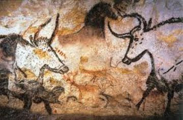
Drawing has changed in form and purpose relative to the role art and artists have played in various societies over the past several centuries. Such as that illustrated in the cave drawing above, did it represent the day's hunt or animals that were revered? The REnaissance was a huge changing period for drawing, as it was vital to the spirit of investigation and cultural rebirth. Look at the drawings of DaVinci or Michelangelo, their expressions are vastly different from the folks living in the caves. In the late 19th century, innovation played a big part of the drawing process with the addition of collage, layered pastel work, and monotype. Today drawing has reached a new height of independent status. Drawing can be enormous and richly textured. The format and vocabulary of drawing have been extended into room-filling environments with the addition of found objects, printed materials, and even video animations.

Drawing today is about the importance of individual expression and originality, and by means of its flexibility of form and processes, it's directness of execution, drawing is ideally suited to communicate the artist's touch and thought to the viewer. Let's start drawing toward our discoveries.

Thursday, June 24, 2010

Summer Series

Another summer session is finished, and now the assessing of six weeks of development in the practice of drawing, seeing, interpreting, expressing, and feeling is well under way. Still a few more hours of considering the surprises, decisions, expectations, and directions that have manifested before I have to get on line and send in final grades.

Again, similar to last summer, I think there were some amazing things that happened in this short period of time, and many of those amazing things came in the form of the series projects. I'm including examples from each below. In cases where it was logistically easy given the time element of when I have to have my work completed, and the work was small enough in scale to shoot the entire series, I did so. However, in many cases, I have only included one of the series to at least allow a glimpse of the varied directions everyone took in the process.


Allison did a series of eyes, each one confronting the viewer with a gaze of confidence and subtle expressions. They were executed in graphite and colored pencil.


Will's series was a four panel segmented Macaw, the head, then the torso and wings, and then the feet. Done in pastels, charcoal, and colored pencil. He called upon his experience in Florida when his family raised these beautiful birds.


Sue completed three mixed media quilts, in which she drew with thread and colored markers, exploring some of the plants from her garden.


Shawn explored a variety of ideas but then settled on landscape. This one, done from direct observation in Cave Hill, was the cream of the crop. Not only was I in that particular place, but I can imagine being back there just by looking at this drawing.


Randilyn created four exquisite pastel drawings inspired from her own experience with the "sounds of silence". Each panel is loaded with color, texture, and maturity of expression.


Miri created four large scaled graphite drawings expressing the abnormalities in the perception and expression of reality.


Michelle's series of five panels looked at the vegetables that are in her garden that are, in part, based on her personal experience in the food industry.


Louise continued the series she began in the spring with water and how light reflects and refracts in combination with the figure, perhaps moving a little more toward the abstraction of the inspiration.


Kim took a cathartic journey through a tough part of her past with three large scaled graphite drawings.


Katie was a bit lighter in subject with a series of four dog portraits, with each showing the unique personality of each puppy.


Greg did four bugs, each in tight detail and beautifully rendered. You could feel the prickly crustiness of each one. He worked in Water color, charcoal, colored pencil.

Elle took the political route with her three panels, exploring the predominance of media representation of Bush, Clinton, and Obama.


Connie was in her garden and inspired by the flowers and the element of nostalgia inherent in polaroid photographs.


Brittany captures the personalities of three friends from Facebook photos, using charcoal and pastel.

Aberlyn had three panels that explored the relationship dynamic that exists between she and her parents. Functioning both as triptych and as individual pieces, they are loaded with content, expressed with a variety of media, iconography, and construction.