Thursday, February 18, 2010

Frottage


Hands engaged in Frottage:


Frottage (from French frotter, "to rub") is a surrealist and "automatic" method of creative production. The artist takes a pencil, graphite stick, charcoal stick, or some other drawing tool and makes a rubbing over a textured surface. It was developed in 1925 by Max Ernst. He was inspired by an ancient wooden floor where the grain of the planks had been accentuated by many years of scrubbing. The patterns of the graining suggested strange images to him and he captured them by laying sheets of paper on the floor and then rubbing over them with a soft pencil. Think what he would have done with a stick of graphite!

Food Magnification


The next out-of-class project was assigned on Tuesday and there are fourteen days until we have our midterm critique over the finished pieces. This project is one of the more challenging because it requires a lot of looking, a lot of seeing, and a lot of drawing. But the final piece is almost always extremely rewarding. Not only does it strengthen our powers of observation, but our drawing skills get sharper at the same time. It requires commitment to being the best you can be at a process that is still new to many of you, but rewards will be huge.

Some tips we discussed the other evening include: make sure your grids are composed of verticals and horizontals, and that they are 1" on the photo and 3" on the paper; draw your grids lightly on your drawing paper so the system doesn't interfere with your finished piece; chamois and blending stumps can be used but do not rely on them entirely, use your mark-making to create an active and engaging surface; study and duplicate the values you see, maybe even check it with your value scale; budget your time well during the next two weeks for the project since it constitutes home work.

Individual critiques of the drawing in progress will be conducted on Thursday, February 25. I will have a sign-up schedule in class tonight. See you then

Wednesday, February 10, 2010

Exhibit Opportunity

If anyone has some art they'd like to enter in a show in Jeffersonville, go to:

www.springintoart.org

I'll be serving as the awards judge. I'm not sure how or who will be jurying, but it would be good to see some stuff from IUS.

Tuesday, February 9, 2010

Lots-O-Snow


I hope everyone is enjoying the day off, playing in the snow. I think I'm over the shoveling though. I'm also a little bummed that we won't get to have a drawing session tonight, but that's nature. This is the kind of snowfall that inspires charcoal drawings, and so maybe you'll get out your drawing materials, pull a chair up to a window, look outside and start sketching. I played a little with photoshop to create a little "charcoal" sketch of some snow covered pines (click on images to enlarge). Enjoy.

See you on Thursday, I hope. Don't forget to bring in your reworked perspective drawings and the evaluation sheets as well. We'll get into some textural stuff then.

Thursday, February 4, 2010

City Scapes

Below are some examples of two-point perspective drawings from F100 Basic Drawing. In some cases, very light pencil work was lost in the digitizing process, and some of the camera/lens distortions rendered some verticals less that vertical. However, what is evident in these drawings is an illusion of space created through rules and principles of Linear Perspective, and a grasp of how to utilize those tools. You can click on the drawings for a larger version.

Jerry's view of a corner pub is loaded with detail and the perspective is effective in communicating the receding spaces down both intersecting streets.


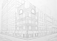
Jennifer's drawing combines three corners and an abundance of perspective details, cornices, windows, doors, balconies, even a curved glass atrium. The space works very well.


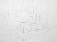
As I sit here at my MAC writing and loading this post, I am struck by the way that Jason managed to put the apple logo into perspective. It would be fun to see some computers in the windows.


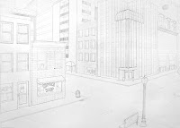
Dustin has also taken a corner view that sweeps down two streets, yet he manages to keep us on the sidewalks. The perspective is effective in suggesting those spaces.


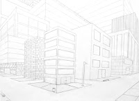
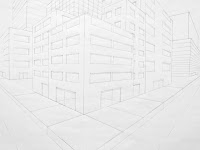
Adam has created a maze of buildings with alleys cutting in and out between them, the brick work on the left adds some interesting spaces to the drawing.


The first round of out-of-class projects have been submitted, and we'll talk about them a little this evening so that my written comments, which often aren't legible (so I've been told), will be clear. I want to insure that anyone who wants to resubmit next week will know the direction they need to take.

There were fourteen days from the time the project was first discussed until Tuesday when they were submitted. I also devoted one of our in-class sessions for the planning phase of this out-of-class project. So, if you factor in the amount of out-of-class study required per week for a three credit hour class, my expectations of effort were satisfied if I was looking at a drawing that appeared to exhibit at least nine hours of linear perspective study (drawing). Several satisfied that expectation. According to Greg Roberts, Arts and Letters Academic advisor, for every hour you spend in a class per week, you should devote three hours outside of that class for study. Studio classes are not like regular standard classes, we meet six hours per week instead of three, so I don't expect eighteen hours of study (drawing) per week beyond the six in-class hours, but expecting six hours in a two week period is not unreasonable.

Anyway, we'll hit a few areas of discussion this evening to become more clear about such projects and the efforts needed to be the best we can be in that regard. See you later.


Tuesday, February 2, 2010

The value of value.

The term chiaroscuro has its roots in Italian, where it literally means the combination of light (chiaro) and dark (scuro). In our drawing class it refers to the technique of applying subtly blended shades of gray to imitate the varying intensities of light and shadow that occur when light is directed toward and reflected off three-dimensional forms, such as the white plaster forms we've been working with during drawing sessions. Chiaroscuro is a powerful too for defining the mass and volume of individual forms, for describing surface texture, and for establishing and clarifying the space that exists between objects. The value scales you created over this past weekend should help you in seeing and representing some of the subtle values that most people overlook is objects under a direct light.

When you think about creating a drawing that has a wide range of value, you have to consider that he white of our drawing paper is the brightest white that we have at our disposal for describing the highest level of illumination in a drawing. It's important to identify those areas of our drawing that will remain white. Once these are identified, we can proceed to push everything else back to an appropriate level of "nonwhiteness". If you squint your eyes at the subject, the lightest lights and the darkest darks should become evident.

Rarely do shadows appear as solid black, they usually reflect some light, and they usually have a subtle gradation that changes throughout the shadow area, be on the lookout for that.It is usually slightly darker near the edges of the shadow where it comes into direct contact with the lighter areas (remember simultaneous contrast) and lighter toward the center of the shadow.

We really can't duplicate the intensity of a brightly lit still life by relying on the white of our paper, but we can come close to the dramatic effect of that by exaggerating the darks. Pushing the values down a step or two on the value scale will allow the highlights in your drawing to appear to glow with the same intensity and clarity as your perceptual experience.

We'll get a bit more complicated and challenging this evening and see how our drawing experiences are helping us to see better. Please refer to the post of September 22, 2009 for additional stuff about value.

See you tonight.