Click on any image to enlarge.
 Amanda Straley
 Will Garner
 Wende Cudmore
 Troy Haggard
 Susan Brown
 Shawn McPherson
 Greg Truesdel
 Alex Kennedy
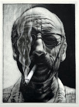
The images above represent some of the drawings that were submitted for critique this past Thursday evening. It was an engaging critique with interesting discussions about how ideas originated in regard to the concept of bridge, and what those ideas went through to get to these final visual expressions. Each participant was thorough with their presentations and the ensuing dialogue was enlightening. Prior to the drawing critique, the class went to the Israel Davis lecture. Davis' presentation was very interesting and honest, so it was a good lead-in to our critique. I'll post the other bridge images after the suggestions and recommendations that were raised during the critique are incorporated into the works.

My personal favorite is the 4th one down. It looks almost like sand in the picture. Is that actually 'just' a drawing? If so, how the heck did she do that?
ReplyDeleteI kind of like the sepia-toned image of mine, but Shawn's definitely looks better in the original gray.
ReplyDeleteI also blog almost all my drawings in my livejournal.
My apologies for the color distortions, shooting under florescent and tungsten always tones the images a little....or a lot.
ReplyDeleteI think this was a very nice group of work. I really liked seeing the variety of media and interpretation. We have a great class and I think we push each other in better and even new directions. I know it keeps me motivated anyway.
ReplyDeleteAs well, I agree with Shawn, I loved the different interpretations of what a bridge meant to each student.
ReplyDeleteI feel as a student, you should always push yourself in different types of medias, that you don't feel so comfortable in. Push it to the limit just to see how far you can go.
pretty stoked on some of these images///
ReplyDeleteI'm with Connie about the fourth one down. Wow. I'd love to know how that was produced. All of the drawings look great to me.
ReplyDeleteokay the fourth one down is mine i made it out of clay and it took forever. first i made the "paper" a slab of clay out of four different clays. then i used a white pure clay for the bright parts and a red for the dark, also a medium one too. lay the coils and then carve away the rest, then put the rocks and texture in. not quite in that order.
ReplyDeleteand the critique was good, and definitely enjoyable. everyone had great work!
ReplyDeletewe do have a lot of talented people in our class, I learn a lot from other classmates with each class. I really enjoy seeing how each other works.
ReplyDeleteTroy's image was inspiring to me. I took ceramics last semester and didn't really enjoy it all that much. But he makes it look so easy and fun. His image was amazing.
ReplyDeleteI was looking back through these pictures and I love Alex's becasue it reminds me of the final project options.
ReplyDeletei'm very confused about how the misshapen fork is a bridge. I'm sure it does I'm just not seeing it but all in all I like the drawing it is very interesting.
ReplyDeleteForgot to mention my favorite is definately Alex's. I love that it is something that i would never think of to draw for a bridge drawing. It was a very interesting take on the bridge drawings.
ReplyDeletemy favorite is the picture by wende...i like how it really makes me feel that i am right there in the picture..i feel like i could walk into the picture
ReplyDeletesusans picture looks so real..it doesnt look drawn..just looks like it was a photo..i love to see what other peoples talents are
ReplyDeleteWende: Your picture looks like a roller coaster ride. I like the face in the middle.
ReplyDeleteTroy: Is your picture 3D? There is a great eye for detail shown.
ReplyDeleteSorry for the incredibly late post, but I may as well answer SLTipton's question: The misshapen fork is representative of the 'bridge of the mind'. I had done quite a lot of independant research into psychic phenominon in my first year here, and wanted to represent this in my work. First of all, the 'bridge' can't necessarily be seen with the eyes. This is a representation of the idea that the mind is able to bend reality to it's will, that the mind is the 'bridge' between us and reality. Everything we percieve, think, understand, do, assimilate, etc. goes through the medium of the mind. I didn't feel that the brain would be as effective at suggesting this as a misshapen, or 'telekinetically altered' fork, due to the objectivity of simply drawing a brain. A brain by itself is just a mass of cells, where as the result of the mind (ex: the distorted fork) is an example of the ability of the mind to distort reality, as well as perceive it. Hope this is helpful :)
ReplyDeletethis seems like an interesting concept for a project. i would like to hear more about how these images tied in with the artists thought and creative process.
ReplyDelete