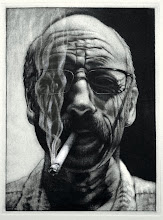
 Susan Brown
 Alex Kennedy
The evening drawing class responded to the Narrative Point of View with some pretty engaging images, some of which are included here. The project called for a combination of the human figure and an architectural scene with a dramatic point-of-view defining tension. The image was to be composed in such a way as to essentially position the viewer with a strong placement in relation to the figure. There were many more provocative images that were well executed and still others that will have their narratives strengthened even more.
The assertion of point-of-view in an image provides a compositional role for the viewer, bringing the scene into a dynamic relationship with the viewer's space. In some cases the viewer remains narratively neutral or uninvolved. It happens. We had some that did both, some of the images felt like we were there in the scene, while others we were observers from the outside, almost voyeurs. All in all, I thought it was a good and challenging project, and the next time it rolls around into one of my drawing classes, there will be some tweaking/discussion to make sure the spaces become more enticing and a stronger part of the viewer's world.


I like these pieces. They are each striking and engaging. Very nice!
ReplyDeleteI like all of these pictures. Alex Kennedy's pic. to so cute I can see walking in finding my room painted in green by a little kid. Although I would freak out it would be fun to just to have random colors painted on the walls.
ReplyDeleteI really enjoy all of these pieces..I would have to say that my favorite points of view are Susan Brown's and Amanda Straley's..I also really enjoy the texture of the fabrics in Greg Truesdel's piece..
ReplyDeleteI must say that this one gave me the most struggle of self. Took me a while to come to this conclusion but it's always good to get the gray matter engaged.
ReplyDeleteI loved all the different ideas our class came up with from one theme. I have to say making up the stories behind the drawings @ the critique was really fun!
ReplyDeleteAlex Kennedy's piece stood out the most for me. Simply because I thought it was funny, but aso executed very well. The look on the little boy's face is priceless, as if someone caught him in actions and he is completely shocked. However, I can't figure out what was used for the green?
ReplyDeleteI have to say that Alex's is one of my favorites. I just find it to be the most engaging because of the expression on the child's face. It pulls me right in and gives me a glimpse of a scene I hope never to find in my own home.
ReplyDeleteAlex's drawing is my favorite. It does create tension but it is very light-hearted and fun. I like the mixture of media, I think that it adds to the overall appeal.
ReplyDeleteI really like all of the drawings that are on here. One stands out to me and it is Susan Brown's the man on the steps. I find it to be intriging and it makes you wonder what his problems are that makes him look so unhappy.
ReplyDeleteAll of these turned out awesome! I really like Greg's because the woman in the bed looks so real with the way the fabric is draped around her body and with the leg sticking out it looks very natural. The texture of the fabric also seems so real. I'm amazed and would really like to mimic his technique.
ReplyDeleteThese are all great! I really liked Greg's. I'm thinking this was intentional, but even if it wasn't, I like how it seems (in the shadows) that something is happening that really isn't. How the shadow of her hand looks like a weapon. There is great attention to detail!
ReplyDeleteI really like Amanda's drawing as well. I like the ears =] How you drew the reflection in the mirror is great!
Sometimes critiques are not "fun" to go to, but this one I think we learned alot about each other and how we approach our projects.
ReplyDeleteThe picture that Shawn has done reminds me of my older brother a couple of years ago when we went to visit my grandparents. It is done really nicely.
ReplyDeleteI love all these works. They look amazing. I think my favorite one is Alex's though. The reason I like it is because me and my sister did something kind of like that once at my grandma's. We probably had a similar look on our faces as well when she found us.
ReplyDeleteall these art picutres look great. i love the shaging in greg's it lookks awesome...i also like alex's because it is a entertaining piture
ReplyDeleteI just wanted to add that after looking at these again, I really love the one by Alex. I love how it still looks kindof "sketchy" but it makes it fun.
ReplyDeleteI love the greg truesdel picture. It is a great picture and is very realistic. It really looks like a scene from a movie that you would see. Great drawing!
ReplyDeleteAlso, i like the drawing of the baby with the paint splattered everywhere although i find the baby to be a bit scary looking. i can't put my finger on it but something about the baby is strange to me. But it is a great drawing.
ReplyDeleteI loved all of these drawings, but one of the major ones that stuck out to me was Alex's. I still think it's him :)
ReplyDeleteI absolutely love the two comps. by Kennedy & Truesdel. I saw both in the studio. Both are great and tell unique stories.
ReplyDeleteSusan: Your drawing reminds me of how my son probably saw me this weekend. Frustrated and "ugh" at the bottom of the steps!
ReplyDelete