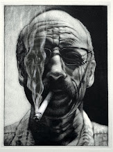
I've received a few emails in the last 24 hours about "backgrounds", negative spaces and shapes, figure and ground relationships, so here are some thoughts. Do you have some ideas that may expand here?
"Backgrounds", or negative shapes/space, are useful in strengthening your vision of how you want to represent your subjects whether they're flowers, clouds, portraits, or skulls on a keyboard. Backgrounds can soften the presentation or make it more energetic or dramatic.
However, whatever you do, make sure that the background works with the subject and not against it. Also, don't forget that the subject is the reason you started the drawing in the first place. So, don't get caught up in your background to the point where it starts over-powering your subject and diverts the attention of the viewer from your subject.
Here are a few tips on how to proceed with backgrounds so that they become a plus for the finished drawing:
Values
Take a clue from the values of your subject when choosing the value scheme for your background treatment. If your subject is very light on one side, as was mentioned in Jessica's flower images, it is always a good idea to make the background in that area darker. This will introduce the necessary contrast.
It also solves the problem of white against white. For example, if your subject has white petals, it is always difficult to make it sufficiently show against the white background of your white paper. Daphne is beginning to resolve this in her Dogwood image in the previous post by introducing a different color and darker value to the background. Introducing a darker background around the petals is a strong solution. This, of course, also works in reverse. If your subject is dark, you may want to contrast this with a light background.
Lost and Found
The background treatment can also be used to produce so-called "lost and found edges". These are edges that initially show but then get lost in the surroundings to finally reappear somewhere down the line, such as in Nate's computer.
The disappearing act of the edge is accomplished by rendering the edge and the surroundings with the same value. For example, the edge of Nate's computer was partially lost in the background by giving the background the same value as that part of the computer. Lost and found effects are always interesting and involve the viewer in the process of conceptually completing the drawing.
Location
It is usually a good idea to keep the shading below the eye level of the subject you are drawing. Shading above the eye level tends to weigh down the subject and does not add to the crispness. Sam's clouds may explore this possibility more fully.
Extensive Background
Sometimes your idea may require a detailed pictorial background. Always be aware that the subject must remain the focal point of the finished product. So, develop the facility for judging what enhances the subject and what detracts from it. The background is invariably secondary to the subject, but equally important to the total and final form of the drawing. Ideally, a pictorial background should talk about your subject and give the viewer more information about your subject. A background is also very useful to create or enhance a mood. If your subject is portrayed in a certain mood, you may want to enhance that mood by adding the appropriate "background."
I hope these ideas give you a good start creating "backgrounds" with confidence.

I'm not sure there is any recipe for a background. I can only offer my methods. If I am drawing a flower, for example, I plan the whole drawing using a tiny thumbnail sketch. I might even spend some time coloring and playing with value in my thumbnail. I try to make my thumbnail a scaled down version of the final drawing so that I can get layout and composition correct. Once I start on my final drawing, the tiny thumbnail get used as a guide to layout everything on the larger version. If I was doing a flower, I would not start by drawing the flower first. I work all over the drawing usually starting by laying down some areas of color where my darkest shadows are and large areas of color as shapes skipping around to the same colors building up in layers. If my flower was the focal point, it would get the strongest value range - either the purest colors, or the most extreme blacks and whites. My flower might have extreme detail while the background remained vague. It might have bold colors while the background remains gray or washed out, muted colors. I might even do the whole drawing in bold values, then start graying out the background with washes or thin layers. Finally, sometimes I like to create completely abstract backgrounds my covering my whole drawing area in splashes of ink or graphite or maybe dripping paint. Backgrounds should not be an afterthought, nor should you spend all your time on them. Don't wait until the last minute to do a final drawing. At least have some type of plan sketched out for the entire finished product. I know numerous people who use photoshop for planning.
ReplyDeleteThat makes all kinds of sense, Shawn. Thanks.
ReplyDeleteWell the posts are helping me to begin understanding the approach to an appropriate background. Its too bad the semester is already almost over and we wont really have much more practice.
ReplyDeleteThere's still 17 days before final portfolios come in, and with the next several sessions exploring landscape, there'll surely be time with that work to better understand the function of backgrounds.
ReplyDeleteI have been working hard to figure out background Ideas for my pieces Im really excited how its working out so far:)
ReplyDelete