Tuesday, December 15, 2009

Final Projects

The group critique started with groups of four critiquing four other drawings from another group. We had tried this process before, but this time all the kinks got worked out before hand and the discussion process was very productive and constructive.


After the group critique, Kirsten, Craig, and Lori kept going after everyone else had left the studio.


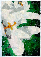
Tana Tidd's horse gear.


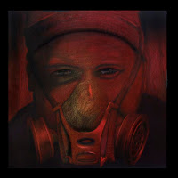
Sam Chumley's self portrait with mask.


Lacy Crouthamel's self portrait with mask.


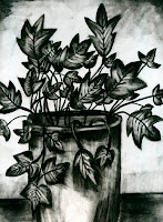
Jessica Hagedorn's autobiographical still life.


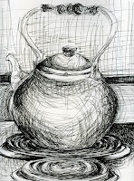
Craig Banks' worm's eye view still life.

We got the things wrapped up on December 8 with our best critique of the semester. Unlike previous sessions, this one was engaging until the very end, and then there were a few who stayed longer to continue discussing the drawings. It was pretty amazing to see how much growth there had been in every one's work, and for many this was a first time experience with drawing.

Once I started to review the portfolios that growth became even more evident, and there seemed to be a direct correlation between the development of drawing skills and activity in the sketchbooks. To those who used their sketchbooks to increase observation and manual skills, I hope you too can see the improvements.

Good job everyone and hope to see you next semester.

Saturday, November 21, 2009

Drawing toward the final project...

Tana Tidd


Richelle Greenblat


Jessica Hagedorn


Gilbert Garcilazo


First, I didn't get the chance to get examples shot of the alternative self portaits, so I'm including a few here that were submitted a little later that I still had in my office.

The final project has been assigned so everyone is on their way to getting fully absorbed in the details of that. Options include a "worms-eye" or a "bird's-eye" view of a still life, no horizon line or back edge; an additive and reductive drawing of a still life with interesting and engaging forms; a self-portrait with a mask, and finally an open-ended option that was to be presented as a proposal with to-scale sketches. I had one of those, but the plan has since changed back to one of the other options. So we'll essentially be looking at a group of drawings based on option #1, #2, or #3. I'm sure there may be variations on those, but as long as the gist of those ideas is there, then the only surprises will be in the strength of the executions of the images. I anticipate a group of drawings that will clearly exhibit strong developments in the skills and comprehension of composition, effective use of the art elements, critical thinking skills to resolve the creative problems that manifest during the execution, ideas that are well considered and unique, and well crafted final projects.

We won't be meeting until after the Thanksgiving break on December 1, so I am hopeful that everyone will utilize whatever time they can grab over the holiday to explore this final project. Have a great Thanksgiving!

Tuesday, October 27, 2009

Alternative Self Portraits

The next out-of-class project has been assigned and everyone is well on their way to having a new "best effort" for our November 5 critique. Some examples of this project from last spring can be found by going back to April 8, 2009 to the "Hidden Places" post.  In fact there are a few of those shooting into the purse images that are also subjects this go-around. I know there was some frustration with the previous project because there was so much of the same thing (i.e., popcorn, grapes, goldfish, sunflower seeds, etc.), but this time I expect you'll enjoy the process more since you are doing more self-exploration with the images. The critique will be more engaging as well since there will have to be some discussion about "who" we are in those drawings. Hope they're going well, there are ten more days for this self exploration, make the quality of time good.

Friday, October 23, 2009

The last Course

Kevin's grapes.


Heather's Goldfish.


Gilbert's Popcorn.


Craig's Pineapple.


Brittany's Sushi.


Here are some of the food drawings that came in this week after some revisions based on critique comments. They look pretty yummy!

Thursday, October 15, 2009

Yum, yum!

Will Goolsby's Sunflower Seeds


Tana Tidd's Chex Mix


Sam Chumley's Saltines


Lori Richie's Nutter Butter


Kirsten Goodman's European Waffers


Grace Stetenbenz's Animal Crackers

The midterm drawing projects of food magnification have arrived on the table and there are several tasty images. This was, of course, a big project and took considerable time and effort, lots of looking and lots of mark-making, but I think it's a project that always indicates a considerable level of development in the working process of beginning drawing students. If for nothing else but to recognize that the effort will expand skills significantly, skills in drawing and skills in seeing and recognizing the subtleties of our world.  Commitment to be the best you can be in any project, in any studio class, is always the ultimate goal, and there were many fine examples of that in this group of images. I have included a few with this post that were at a stage of finishedness (is that a word?). I'll look forward to seeing how they all get finished and resolved by next Thursday.

Wednesday, October 7, 2009

FOOD MAGNIFICATION

Tomorrow will be an in-class working day for the food project.  While you're working on your drawings, I'll meet with each of you for a brief look and discussion about where the drawing is, where it's going, and what needs to happen to get it there.  Again, this is a time intensive project, so investing a few hours a day is a really good plan.

A good test to measure how your drawing is going is to take two pieces of white paper, cut a one inch square in one and a three inch square in the other.  Then place the one inch square over one of the gridded sections of your image, and the three inch square over the corresponding square of your drawing. Now squint your eyes and see if the drawing matches the value range of the image you're working from.  If they match, you're in good shape.

See you tomorrow.

Tuesday, September 29, 2009

FOOD MAGNIFICATION

The next project has been assigned and I trust everyone is on their way to 'cook' up ideas for their food drawings.  It might be a good idea to look back at past posts about the project from last winter's F100 class.  Look at Thursday, March 5, 2009 and Tuesday February 17, 2009.  There are a few images from that class, plus the pdf I sent you yesterday should provide you with a lot of inspiration. Mmmmm, can't wait to see your ideas.

Friday, September 25, 2009

Drapery Studies

Sam Chumley's drawing breaks the various surfaces down into fairly aggressive marks that accumulate into a wide range of value. The effectiveness of the open composition creates some strong diagonals of lights and darks.


Gilbert Garcilazo's marks are much more subtle and suggestive of the reality of the space and the gravity of the drapery.

 
Coby Vaughan's drawing has an energetic approach to mark-making that adds a sense of urgency to the image allowing her point of view to be expressed.


Camille Stettenbenz's drawing explores the abstract qualities of the light and dark patterns of the fabric, setting up a strong sense of repetition and rhythm.


Jessica Hagedorn's drawing is a strong open composition that is enhanced by the way she explored her marks relative to the surfaces she was viewing.


So we exercised our seeing and mark-making skills with drapery as subject, hanging on the wall with a strong light coming from one direction. I thought there was some good progress in many of the pieces. Developing a sensitivity to the touch of the pencil on the drawing surface and the ability to discriminate subtle changes in the marks of the pencil, or any drawing tool, on that surface are some of the most important parts of the drawing process. Developing our powers of observation is also hugely important, not only as human beings, but also for many in our F100 class who are growing and emerging artists.

These are very basic sensitivities but ones that, because of the refinement and energy they require, are both sophisticated and challenging. It is challenging to invest extraordinary concentration in an activity that is generally perceived as utilitarian.  Focusing attention on something as routine as using a hand-held tool to make marks on paper requires that we temporarily detach ourselves from the distractions of our over-stimulating environment and devote our attention to the simple experience of direct sensory awareness.  That actually may be one of the biggest challenges.  Drawing demands active and purposeful participation.  

Tuesday, September 22, 2009

The value of value.

Our exercise today involved white forms on green drapery (or at least I was told it was green), and to work with the values as they described the forms and the spaces. There was a lot to deal with and, in turn, there was a lot of frustration expressed. So we're going to simplify on Thursday and try to get more involved with drawing from observation and developing a mark-making approach to building up values.

Drawings with value compositions allow us to take all kinds of visual journeys. Each of our processes set up different rhythms in our work as we discussed at the end of class and the most expeditious means to an end doesn't necessarily teach us very much.  But those rhythms are important. Some of us draw with a fast tempo and others may be slower; some of us are precise and others may wander.  However, as our eyes move around our subject, like the one depicted above, we tend to look for groupings and patterns to organize so that our values and shapes make sense in the final image.  Value needs to describe those volumes and spaces in our work, and it needs to move our eyes around the image, it needs to engage us on all kinds of levels.

We all understand now, I think, that an important use of value in drawing is the development of compositions based on light and dark. Chiaroscuro (chiaro=light, scuro=dark) creates the illusion of solid form in a believable space.  One of the best ways to learn that is to draw drapery strongly lit from one side.  We'll explore that on Thursday. 

GUIDE TO STUDIO FOUNDATION BASICS

The on-line text for foundation courses (F100, F101, F102) is now available through our class Oncourse site.  It's gone through a lot of improvements and is much more user-friendly. Remember that this is the text that your pretest was based on, and will also be used for your post-test at the end of the semester.  Start spending some time with it.  You'll be glad you did.

See you shortly.

Tuesday, September 8, 2009

COMPOSITION

Hey, everyone, check out the PowerPoint about composition on Debra's blog, yourmindseyes.blogspot.com, it's pretty good and a good introduction to our next ventures. It's located on the left side of the page under PowerPoints (for class). See you soon.

Also, check out Shawn's comment, he has a link to a short video about composition.

Friday, August 28, 2009

LINEAR PERSPECTIVE

For those of you who might need a refresher while working on your drawings, try THIS. It's a pretty good explanation in a pinch. And try some youtube videos, there are a couple that are fun to watch as the drawings develop, just search for "linear perspective". And actually, this site is pretty good as well.

Enjoy.

Wanted to add to this that Professor Debra Clem has a powerpoint on her class blog about perspective.  If you click HERE and then on the left side of the page click on Perspective under PowerPoints (for class), you can go through all of the images and read the text.  It covers the stuff we discussed about the flatness of art before the Renaissance.

Friday, August 21, 2009

A New Semester: FALL 2009

Welcome to a new semester of drawing.  There are many postings on this blog that began last winter.  There are a number of examples of projects from previous F100 Basic Drawing Students through advanced level students.  Many of the out-of-class and in-class projects you'll be exploring this semester are showcased with examples, so you may want to review some of the past entries to see how other members of the drawing community interpreted and expressed themselves with those projects. If you want to see a larger version of any of the drawings, just click on them.  Also, when you get to the bottom of each page be sure to click on "older posts". There is a syllabus for the course located on our ONCOURSE site and I will have hard copies for you to review and discuss on Tuesday during our first class session.  Enjoy the blog, the drawings, and the discussions and I'll see you Tuesday, August 25. 

Tuesday, July 21, 2009

8th Annual Art Car Weekend

The IUSARTCAR will b e featured during the art car weekend, August 6 - 8, including first Friday on the 7th, and parade on the 8th.  We'll have some exposure on WHAS this Saturday and throughout the next two weeks leading up to the weekend, and on August 6 on FOX 41. The IUSARTCAR book, created by Steve, has received attention from the KMAC and they have expressed interest in having the book for sale in the KMAC Gift Shop. Stay tuned for more info.

Monday, June 29, 2009

Summer Session I Portfolios

I have condensed all the remaining portfolios from Summer Session I into the drawing studio. There are several still to be picked up. That studio will be cleaned soon, so you'd better get your things before they become "examples" for the beginning classes, and free portfolios for the newby's .   

Thursday, June 25, 2009

Summer Session I: Drawing (wrap-up)

Portfolios are ready to be picked up.  Make sure you also get your series.

It was good to look through the portfolios and see some of the surprises from our Cave Hill and Falls of the Ohio trips, especially since there had not been an opportunity to see some of them before.  The finished quality many of them possessed was, indeed, a welcome sight.

This was a fast, furious, and enjoyable six week session, and the dynamic I thought was inspiring. I appreciated the amount of sharing that went on with this blog and hope that you'll check back from time to time just to see what's happening with our drawing community.  I also hope that regardless of your concentration and/or major, that you'll continue to exercise the development of your skills, both manual and conceptual, in your sketchbooks.  And as Fine Arts majors, I hope you will continue to explore the contemporary world of art and become familiar with the vast range of contemporary theories and the artists who practice them. 

Be sure to check out the series post just below this one, and have a wonderful summer.  I hope to see you in the fall.

Wednesday, June 24, 2009

The Series:

Below are examples of the series project from the Summer I drawing class.  In some cases, because of scale or presentation, I was not able to include the entire series on a few.  This was a very involved project for a summer session, and there were many very rewarding results. The expectation of seven hours per week involvement is clearly evident in many of the groupings, and the uniqueness of each series made for an informative final critique.


Fran did a series based on dreams with beautifully drawn sleepers surrounded by very creative dream images that have a "concept art" influence. They are each roughly 22" x 30" with graphite and acrylic washes.


Aberlyn referred to herself as a "Jesus Hippie" in one of our critiques and based this series on her religious beliefs while at the same time allowing viewers to explore the abstract qualities in order to make their own associations. Each panel is about 30" x 21".


Sam explored clouds and their temporary amorphous shapes. They're about 4" x 7" done in graphite.


Trista developed a series also based on her response to the sky and it's contrast to landscape. These images are roughly 6" x 9".


Tiffany developed a group based on the gestation of a flower with the final image in full bloom. Each image is roughly 9" x 7".


Tatum continued her close up examination of flowers through oil pastels and mark making. Each image is approximately 15" x 20".


Shawn's series was four panels about 10" x 40" with mixed media.  It represents a traveling point of view to a metaphorical point of view.


These two panels are parts of Nate's series of four that explore contemporary Vanitas, a type of symbolic still life common during the 16th and 17th centuries.  The word, Vanitas, is latin, meaning emptiness, and loosely translated corresponds to the meaninglessness of earthly life and the transient nature of vanity. Each panel is roughly 40" x 60" done in charcoal.


Khara created a series about waves that was influenced by her participation in the surf culture. There are four different sized panels, about 16" x 10", in mixed media.


Katie did this three paneled series based on a project that she very much enjoyed from her experience in 2-D design, cubist influenced images of a guitar. Cubism was an art movement pioneered by Picasso and Braque in the early 20th century.  In cubist artworks, objects are broken up and reassembled in abstract form, depicting the subject from a multitude of viewpoints. Each panel is about 16" x 8" and done with chalk pastel.


Jessica developed a three paneled series of plant forms, these two are 11" x 9"' in mixed media.


Jerrye had a series of three drawings in graphite, about 18" x 24" also of plant forms in different containers.


Daphne did these nine small drawings of flowers with pastels, they're only a few inches by a few inches in dimension, and she mounted them as 'photos' like one would find in a scrapbook.


Connie did this large piece that incorporates her series of tents into a large piece made from an old tent.  She also drew the accoutrement of period reenactment encampments and essentially collaged those into the image. it's roughly 47" square in mixed media.


These are two of Beth's six panels that take the idea of postcards created about some of Louisville's landmarks, removing sections of the photographic images, and then draws those sections back into the image. They are each about 5" x 7" done with colored pencil. Around each image she has inscribed the latitude and longitude coordinates of each location and then mounted with onto a black surface with photo mounts.


Ashley did a series of nine, 9" x 12" Vogue magazine covers with prominent women in the covers.  They are mixed media and collage.


Friday, June 19, 2009

Sketchbooks

This was one of the pages from Jessica's sketchbook, and by the time she had exceeded the 20 page minimum, her approach and process with charcoal was starting to have a unified consistency and style.


This is one of Fran's pages, clearly showing a commitment to observation and mark making.


This page is from Aberlyn's sketchbook in which she explored a variety of approaches and media. This particular image was almost like a sustained gesture of a tea kettle sitting on a stove.


Daphne's sketchbook also had a variety of media explorations, and this collage was especially intricate in the way she assembled the page.


Katie had several pages of media and form explorations. This particular page (which I unfortunately had to crop on the scanner) did some interesting things with composition and design.

The examples above demonstrate "substantive pages" from those sketchbooks. In same cases there were 19 more pages of equal substance, in others there may have been only a few more. However, when the sketchbook was utilized to accelerate progress in drawing, I felt they were very successful.

This is from the syllabus:

Keeping a sketchbook can accelerate your progress in drawing, and given that this summer course is only six weeks long, use your sketchbook as often as possible. It will constitute, in part, 20% of your final grade. Your sketchbook should have at least 20 substantive pages by the end of the session. It can (and should) be used for practicing observational drawing outside the studio or for recording notes on ideas or visual observations in written form. It can function like a scrapbook or diary (provided you don’t mind me reading it) or a combination of all of the above. It is the best place to work out ideas visually because it is always at hand, but only if you make the commitment to carry it around with you.  Our Blog has a link to Artists’ Sketchbooks Online (Posted January 09) an amazing web site with hundreds of sketchbooks.  The site should be visited as frequently as possible.  There’s lots of inspiration there. The first page of your sketchbook should be used to catalogue your blog entry times and dates.

Sketchbook entries ranged from quick sketches to labored renderings, from collages to media experiements, from observational studies to imagination.  If they were "substantive", then they were awarded credit, if they weren't "substantive", then they didn't receive credit.  I looked for 20 substantive pages (I usually require 40 pages during a full semester).  20 pages = A, 19 pages = A-, 18 pages = B+, 17 pages = B, etc., etc., etc.  You get the picture.

See you Monday for individual critiques over your series.