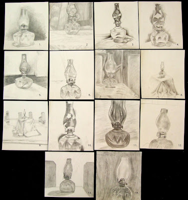
After going over the syllabus and skimming along through other materials, an hour was devoted to our first drawing exercise. Everyone was given a 10" x 11" piece of 2-ply bristol and a No. 2 pencil. A clear glass lantern was place on a draped cube. The instructions were to draw exactly what was seen with no erasing. Moving from top left to right, and each is numbered (you may click on the image for a more detailed view):
1.Well done utilizing the space with a pretty delicate but wide range of values. Seeing more of that textural surface would add more interest to the image and perhaps redirect some of the attention away from the lantern wick housing.
2. Unified and detailed, although chopping off the top puts a lot of emphasis on the bottom third of the image where the drawing process seems to have lost some interest. No.2 pencils are limiting, but pushing for a wider range of value would be good.
3. Good range of value, but perhaps a bit too generalized, especially given the amount of texture and pattern that was on the lower part of the lantern. Where the lantern wick resides is the best observed, other parts become too abstract for direct observation.
4. Same as 3. above, perhaps too generalized, but well drawn and the scale holds the space well. Abstract qualities are stronger than the observed qualities. The challenge was to draw exactly what you see.
5. Interesting how the values on the right negate the space between the lantern and the back wall. Other details are well handled, but try not to get too smudgy with your values. Keep them clean and crisp on subject where they need to be clean and crisp.
6. Careful with placement, proportions handled pretty well, but the line work is a bit hesitant and fuzzy, making the image feel nervous. Practice in your sketchbook drawing forms from observation, start simple then work to more complex to develop a confident line.
7. Although a No.2 pencil is not very versatile, a wider range of value would be good here, also try to expand seeing from the general to the specific. You suggest the textures, now try to represent them.
8. The lantern is well drawn, but so tiny that the drapery dominates, try to expand the scale and move visually into the space. Watch the surfaces that are perpendicular to you, their shapes will hint at the perspective.
9. Like 9. above, the lantern is tiny, even tinier, so tiny it would be hard to say its a drawing of a lantern. Look harder, expand your space, avoid the unnecessary. There's almost more emphasis on everything but the lantern.
10. This one moved in pretty tight so one would expect to really see the detail. Try to see all of the essentials. Those dark areas on the edges become something other than passages of value, maybe there should be more transition in them to relate to the space.
11. Shape, proportion, and detail need some closer observation, but a good range of value. Careful with composition as well. Back ground marks aren't saying too much other than space fill. Be sensitive to your mark making.
12. Try not to get too smudgy with values and watch your proportion and scale, also be aware of how your composing. Practice in your sketchbook drawing symmetrical forms.
13. General shapes are close, but detail is too generalized, values in lantern suggest colored class rather than clear. What makes the class dark..would that be background? The darer side panels adds an interesting element to the composition.
14. Consider your composition, why run it off the bottom? The use of texture adds an interesting element to the image, but the back ground marks aren't saying too much other than space filler. Be sensitive to your mark making.
For an hour long drawing on a small scale, there are some pretty good responses. My responses above are not biased by the expectations of the various levels of drawing, but rather how the image works relative to direct observation - draw exactly what you see - and the formal considerations of line, value, texture, shape, and composition. Of course the 200 level is reinvestigating those elements, while the 300 and 400 levels should be well versed in those areas by now, and maybe only need some 'getting back on the bike' practice. In all of these drawings, if I were to see such images in sketchbooks, I would consider them substantive.
Later.

Can I hide this one? An hour with a pencil I normally color dots in with WILL NOT go in my portfolio. LOL Hell, I use GRAPHITE if I use a pencil in my other classes.
ReplyDelete