Tuesday, May 24, 2011

3rd Still Life

The weather is being very uncooperative and we're stuck inside extending our two week still life exploration into a third week. It's a good thing, though, since a still life drawing can function on may levels and have many purposes. Working in color on the current one will help us understand how color acts in real life, how light moves around the space an forms, lending and barrowing colors throughout. Still lifes can teach us how an arrangement of colors and values can bring a special mood to the drawing. In the case of black and white drawings, used by the majority of us in the last still life, the purpose is different. A still life pencil or charcoal drawing can help us study shapes more closely and see how they interact on our eyes, we learn how to measure correct proportions, and we pay more attention to the details because we're not making the same kinds of decisions as we do with color. In either case, though, how we see the subject and respond to our media can make the difference between a good drawing and a remarkable drawing.

Still lifes are the most available subjects in the world, and while some people may consider still life drawing boring, the fact is they teach us a lot. When you have no idea of what to draw in your journals, just make an arrangement of things you have at home and start drawing. If you keep practicing on drawing still life subjects you will find out that you have a much better understanding on how light works, and how objects relate to each other within a particular space and within a composition.

Below are a few points of view of our current creative problem.


Friday, May 20, 2011

Here are the images from our two day, a little into the third day, anti-gravity, tension, wrapped boxes, missiles, cones, and spheres still life. There are some pretty cool drawings here and I think everyone very much enjoyed this process.


Veronica has a very delicate touch with her pencil and built the image with a pretty unique marking system. It may present more challenge to crop into a composition that allows a closer observation.


Todd got very involved in pushing the graphite around and then erasing into the image. In fact, he may have gotten too caught up in that and never made it to the white forms. Let's try charcoal and see if things move a little faster, or crop into the subject a little tighter.


Stephanie got into charcoal with her drawing and did some abbreviating on some of the folds in the fabric. It's a pretty good range of values on the white forms, let's push to see an equal range on things that are not white.


Shawn used the prisma color stiks and got some pretty nice color layers to move the space around, nicely composed as well.

Philip used graphite here and really did some nice spatial things with the negative area by bringing in the skeleton. That drapery looks great.


Phil moved along slowly with his initial process, but once he found where he was going, the image almost appeared in one afternoon. It would be good to see the detail focus on all of the areas.

Miri painted with charcoal and created a really strong image of contrasts and movement. Beautifully composed.


Lori got into her pastels, and got the local colors of the form down and started to work in the other color shifts before the session ended. It would be good to see more of the details and the effects of colors lending to one another.

Joy used charcoal, pushing it around and then pulling it back out until the abstract elements started to take hold. Keep pushing to see the in-between value range.


Dani built her image one piece at a time. It would be good to see how the negative area might be built so that top plane could have some more drama. Nicely drawn.


Connie confessed that she never uses black...hmmmm...maybe this is the image to give it another chance. Very painterly oil pastels, but needs some darker areas.


Alex's perspective sort of denied the gravity issue creating a fabric encased totem pole. Let's see if some of the finer nuances of the subject can make it into some subsequent works.


Aberlyn move around the form in a one-step-at-a-time approach that created a very strong composition. Very Stephen Posen-esque.

Monday, May 16, 2011

Two-Day Still life


We'll explore the above still life for two sessions which should result in some pretty amazing work. I think the elements of gravity and tension will provide for some pretty unique interpretations. Check back in a few days to see some of the creations.

Friday, May 13, 2011

Stripes and Stuff


I though the still life for yesterday's drawing session was pretty inspiring based on the drawings we saw at the end. The 200 level line exploration I thought went fairly well, although I hope there will be additional efforts in your sketchbooks. Such a deliberate approach is one of the most expedient ways of training the eye to observe accurately, which is a huge benefit to anyone who wants to represent perceived reality. Drawing from close observation eventually prepares us to visualize things that exist only in our imaginations, such as the cloud drawing series I passed out the first day of class. You can clearly see that Brace had a strong visual vocabulary to draw from in her work, she has spent a lot of time looking and drawing.

The value work of the 300 and 400 levels also went well. In our brief discussion, there was a point made about perhaps reducing the scale of the format to insure a more resolved, or finished work by the end of the session. In those cases, it may also be a good plan to try to bring up the composition as a whole rather than piece by piece.

Another point in the discussion had to do with abbreviating. Not saying it's bad, but when the focus is to communicate what you see, there might be too much essential information being filtered out.

So, we'll move on with a new still life next week. Maybe extending it over two classes and using paper worthy of a six hour drawing, I'll see what I have on hand. We'll also take a look at more drawing candidate portfolios, and discuss some series ideas.

Hope the sketchbooks are cooking. Hope your ideas are cooking. See you Monday.

Wednesday, May 11, 2011

Drawing Visual Pretest


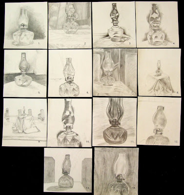
After going over the syllabus and skimming along through other materials, an hour was devoted to our first drawing exercise. Everyone was given a 10" x 11" piece of 2-ply bristol and a No. 2 pencil. A clear glass lantern was place on a draped cube. The instructions were to draw exactly what was seen with no erasing. Moving from top left to right, and each is numbered (you may click on the image for a more detailed view):

1.Well done utilizing the space with a pretty delicate but wide range of values. Seeing more of that textural surface would add more interest to the image and perhaps redirect some of the attention away from the lantern wick housing.

2. Unified and detailed, although chopping off the top puts a lot of emphasis on the bottom third of the image where the drawing process seems to have lost some interest. No.2 pencils are limiting, but pushing for a wider range of value would be good.

3. Good range of value, but perhaps a bit too generalized, especially given the amount of texture and pattern that was on the lower part of the lantern. Where the lantern wick resides is the best observed, other parts become too abstract for direct observation.

4. Same as 3. above, perhaps too generalized, but well drawn and the scale holds the space well. Abstract qualities are stronger than the observed qualities. The challenge was to draw exactly what you see.

5. Interesting how the values on the right negate the space between the lantern and the back wall. Other details are well handled, but try not to get too smudgy with your values. Keep them clean and crisp on subject where they need to be clean and crisp.

6. Careful with placement, proportions handled pretty well, but the line work is a bit hesitant and fuzzy, making the image feel nervous. Practice in your sketchbook drawing forms from observation, start simple then work to more complex to develop a confident line.

7. Although a No.2 pencil is not very versatile, a wider range of value would be good here, also try to expand seeing from the general to the specific. You suggest the textures, now try to represent them.

8. The lantern is well drawn, but so tiny that the drapery dominates, try to expand the scale and move visually into the space. Watch the surfaces that are perpendicular to you, their shapes will hint at the perspective.

9. Like 9. above, the lantern is tiny, even tinier, so tiny it would be hard to say its a drawing of a lantern. Look harder, expand your space, avoid the unnecessary. There's almost more emphasis on everything but the lantern.

10. This one moved in pretty tight so one would expect to really see the detail. Try to see all of the essentials. Those dark areas on the edges become something other than passages of value, maybe there should be more transition in them to relate to the space.

11. Shape, proportion, and detail need some closer observation, but a good range of value. Careful with composition as well. Back ground marks aren't saying too much other than space fill. Be sensitive to your mark making.

12. Try not to get too smudgy with values and watch your proportion and scale, also be aware of how your composing. Practice in your sketchbook drawing symmetrical forms.

13. General shapes are close, but detail is too generalized, values in lantern suggest colored class rather than clear. What makes the class dark..would that be background? The darer side panels adds an interesting element to the composition.

14. Consider your composition, why run it off the bottom? The use of texture adds an interesting element to the image, but the back ground marks aren't saying too much other than space filler. Be sensitive to your mark making.

For an hour long drawing on a small scale, there are some pretty good responses. My responses above are not biased by the expectations of the various levels of drawing, but rather how the image works relative to direct observation - draw exactly what you see - and the formal considerations of line, value, texture, shape, and composition. Of course the 200 level is reinvestigating those elements, while the 300 and 400 levels should be well versed in those areas by now, and maybe only need some 'getting back on the bike' practice. In all of these drawings, if I were to see such images in sketchbooks, I would consider them substantive.

Later.

Tuesday, May 10, 2011

Summer Session 1

Another summer drawing session begins today. It'll be fun to see everyone eager to spend the next six weeks immersed in the creative process of looking, drawing, thinking, seeing, experimenting, sketching, talking, considering, empathizing. As in past semesters, we will explore the process of creating a series of images. There's lots of reference to that process in past posts on this blog, and examples of some series highlights, such as the ones below.


Alex Kennedy's Madonna and Child image that led to the beautiful exhibition that is currently in the Barr Gallery. If you haven't checked our the current graduating BFA senior exhibition, do so before it closes.


Danny Palafox's magnifications of nuts and bolts were beautifully done drawings, rich in texture and color.


Louise Clausen's figures in water was a two semester exploration that eventually led her to new ways of considering the drawing process where she combined liquid and dry media.


Greg Truesdel's series was close-up examinations of bugs. Greg's is also currently exhibiting a series of 'Circus Posters' he created for his BFA thesis, complete with a circus tent he constructed for the installation. Very dramatic. Go check it out.


Aberlyn May's series of three portraits were connected into an alteresque type triptych that explored familial connections and identity.

It's exciting anticipating the new work that will be created during this first summer session. Several new series, all allowing us to see things a little differently, to think differently about what we see, and to find out something new about the artists and their process.

See you soon.

Friday, December 10, 2010

End of the 2010 Semester


My last post on Images and Ideas was back in October. I had gotten to a place where I felt like I was blogging to myself - or is that flogging? In any case, it would have been good to have had on-going dialogue, discussion, interaction, debate...hello, is there anyone there?

I thought that I'd finish this semester with a few drawing highlights from the final portfolios. Maybe even throw in some commentary to see if I get any bites. Here goes:


David Jones has a passion for basketball, and he extended that passion into his series of drawings. Various athletic poses n the way to the basket.


Daniel Marshall's passion is music. Here is one of the drawings he created that was inspired by his musical instruments and equipment.


Alex Stotts did a series of drawn hands depicting the drawing of hands, cut from their context and placed into shadow boxes. Two are represented above.


This is a digital image of a digital image, so I apologize for the reflections. This was Sam Chumley's series project, creating a 'graffiti'-esque image on the basement wall of a friend's home. It was documented via photos and video. The video, some fifty hours worth, went through a collaborative editing and refining process between Sam and Chris Little. The result was a little more than two minutes of fast-forwarding of the process from beginning to end. Maybe Sam will get this posted on Youtube.


Daniel Frank is a skater, and this drawing was one of six he created this semester that explored the dynamic poses of skaters without their boards. He had explored some the Robert Longo images of Men in the Cities.


Wende Cudmore has been experimenting and exploring the production of vegetable papyrus. She's not only creating hand-made papers from the pulps of the vegetables, but she's also pressing the vegetables into thin sheets. In the bottom piece above, the center panel is actually parsnip cut and pressed into a thin, almost transparent sheet, stitched and mounted between plexiglass.


Shane Doebler created a fifteen foot tableaux of psychological narrative that hinted at so many possibilities that it was a little frightening. The image above was conceptually part of that bigger image, but it was on a single panel.


Patrick Berry created a series of images exploring the effects of a mirror in landscapes. In some the reflected image was part of the environment, and in others the reflection pulled information that was out beyond the subjects of his drawings.


Marie Tingle's series was about a pair of dragons. She explored them through four drawings that eventually focused on the textures and colorations. That focus was, in part, inspired by a shift in her medium, from soft pastels to pastel pencils.


Louise Clausen started her series as she left off this summer (check back there to see those images), with figures in water. Only this time an intense experience she had moved her priority and process into a new direction, where gravity and expression took over the representation.


Lori Ritchie did a series of flowers, mostly focusing on the blossoms, except in this one where she got more involved with the space as much as the flowers.


Kristin Thompson created four large-scaled (30" x 40") drawings of a brick in different settings with oil pastels. The surfaces are energetic and the lights and darks very compelling. The scale of each also adds a great deal to the images. Kristin's process is very aggressive, so she needed that much space to be able to move around with her response.


Kim Salaices also created four large scaled images that were more psychologically charged, based on porno addictions. She chose to represent this idea by creating images of bound women with accompanying text, some of which is legible, and other parts not.


Jessica Elam responded to the ephemeral and hypnotic qualities of smoke. She started using pastels and eventually switched to bleach on black Arches that allowed the illusory layering transparencies of smoke to move across the surface.


Fran Dietl's series allowed her to continue investigating fantasy via computer illustration. Although the image above does not do justice to this particular piece, it is clearly an other worldly character that she made hints of in a series she created last summer.


Danny Palafox found some inspiration in some Jim Dine tool images. Here is an example of the three drawings of 'still-life' nuts and bolts, created with pastels and prisma color pencils.


Alex Kennedy's appropriated Madonna and Child images, this one with gold leafing, are intriguing responses to religious representation in the history of art and his own Catholic upbringing.